Internal Tools · Dashboard
Operational UX
Eight moderated sessions, four abandonment-driving flows, one rebuilt information architecture - and a measured 40% reduction in ops time-on-task.
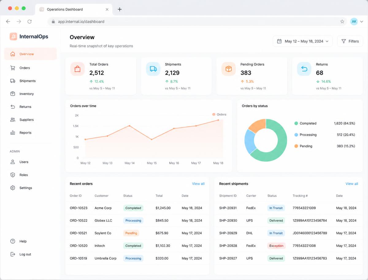
Overview
Falcon's internal ops team was navigating six product verticals through a dashboard built for three. I ran the research, rebuilt the information architecture around tasks rather than product lines, and measured the result after launch.
The problem
Navigation had grown by accretion. New verticals were appended rather than integrated, so the highest-frequency tasks were buried, status language differed between products, and ops managers fell back on spreadsheets and colleagues to get work done.
Approach
- 01
Watch the work, don't survey it
8 moderated usability sessions with operations managers on live tasks, timed and recorded, with every abandonment point logged.
- 02
Rank by frequency and abandonment
Four task flows accounted for most of the pain. Those set the scope; everything else followed them.
- 03
Rebuild the IA around task, not vertical
One mental model that covers all six product lines, even though vertical-first matched the org chart.
- 04
Standardise the surface via Tijori
Status language, table density and action hierarchy unified across verticals, then re-tested with the same participants.
Highlights
Decisions and tradeoffs
- •Task-first navigation over vertical-first, despite vertical-first matching how the company is organised.
- •Dense tables with a strong action hierarchy rather than card layouts - ops users scan, they don't browse.
- •Kept the legacy path live during rollout, accepting temporary duplication rather than disrupting live operations.
What I got wrong
My first IA buried low-frequency, high-stakes actions two levels deep. The people who needed them were under pressure when they did. I surfaced them as an explicit secondary group instead of optimising purely for frequency.
Measurable impact
Business outcomes
- •Endorsed by C-suite and rolled out org-wide
- •Supports operations across all six product verticals
- •Ops infrastructure now supports 96% report automation
Design outcomes
- •40% reduction in time-on-task on the most frequent workflows
- •Top 4 abandonment-driving flows redesigned and re-tested
- •8 moderated sessions with daily users
- •Status, table and action patterns standardised into Tijori
Outcome
The redesigned dashboard was endorsed by the C-suite and rolled out org-wide, with a measured 40% reduction in time-on-task on the most frequent ops workflows.
CASE STUDY: OPERATIONAL UX - INTERNAL OPS DASHBOARD
Internal Tools · Dashboard · Research-led Redesign
One-line summary
A research-led rebuild of Falcon's internal operations dashboard, measured at a 40% reduction in time-on-task and rolled out org-wide.
Research method and outcome
I ran 8 moderated usability sessions with operations managers who use the dashboard daily, watching real tasks rather than asking about them. That surfaced the top 4 task flows driving the highest abandonment. I rebuilt the information architecture around those flows, and post-launch measurement showed a 40% reduction in time-on-task on the most frequent workflows. The redesign was endorsed by the C-suite and rolled out org-wide.
Problem
Falcon's internal ops team was navigating six product verticals through a dashboard originally built for three. Navigation had grown by accretion: new verticals were appended rather than integrated, so common tasks were buried, statuses were inconsistent between products, and people fell back on spreadsheets and colleagues.
Business and user goal
For Falcon: reduce operational cost per ticket and remove the ops bottleneck slowing partner launches. For ops managers: complete the four highest-frequency tasks without leaving the tool or asking someone else.
My role
I owned research, information architecture, interaction and visual design, spec and design QA, working with the ops leads, engineering and the C-suite sponsor.
Process
Step 1: Sessions with ops managers on live tasks, timed and recorded, with abandonment points logged. Step 2: Rank flows by frequency and abandonment. Four flows accounted for most of the pain. Step 3: Rebuild the IA around task, not product vertical, so one mental model covers all six. Step 4: Standardise status language, table density and action hierarchy across verticals via Tijori. Step 5: Re-test with the same participants, then measure time-on-task post-launch.
Decisions and tradeoffs
Task-first navigation over vertical-first, even though vertical-first matched the org chart. Dense tables with strong action hierarchy rather than card layouts - ops users scan, they don't browse. Kept a legacy path available during rollout, accepting temporary duplication to avoid disrupting live operations.
What I got wrong
My first IA hid low-frequency but high-stakes actions two levels deep. Ops managers who needed them under pressure couldn't find them. I surfaced them as an explicit, clearly labelled secondary group instead of optimising purely for frequency.
Measurable impact
Business outcomes Endorsed by C-suite and rolled out org-wide Supports operations across all six product verticals Ops infrastructure now supports 96% report automation
Design outcomes
40% reduction in time-on-task on the most frequent workflows Top 4 abandonment-driving flows redesigned and re-tested 8 moderated sessions run with the people who use the tool daily Status, table and action patterns standardised into Tijori
What I'd do differently
I'd instrument the old dashboard before the redesign. I had qualitative abandonment data but had to reconstruct the baseline for time-on-task; measuring first would have made the impact case easier and the design decisions sharper.